Redefining Craft: The Progressive Way
In a category historically bound to craft, Aberlour builds their future forwards with progressive craftsmanship and the quest for better.
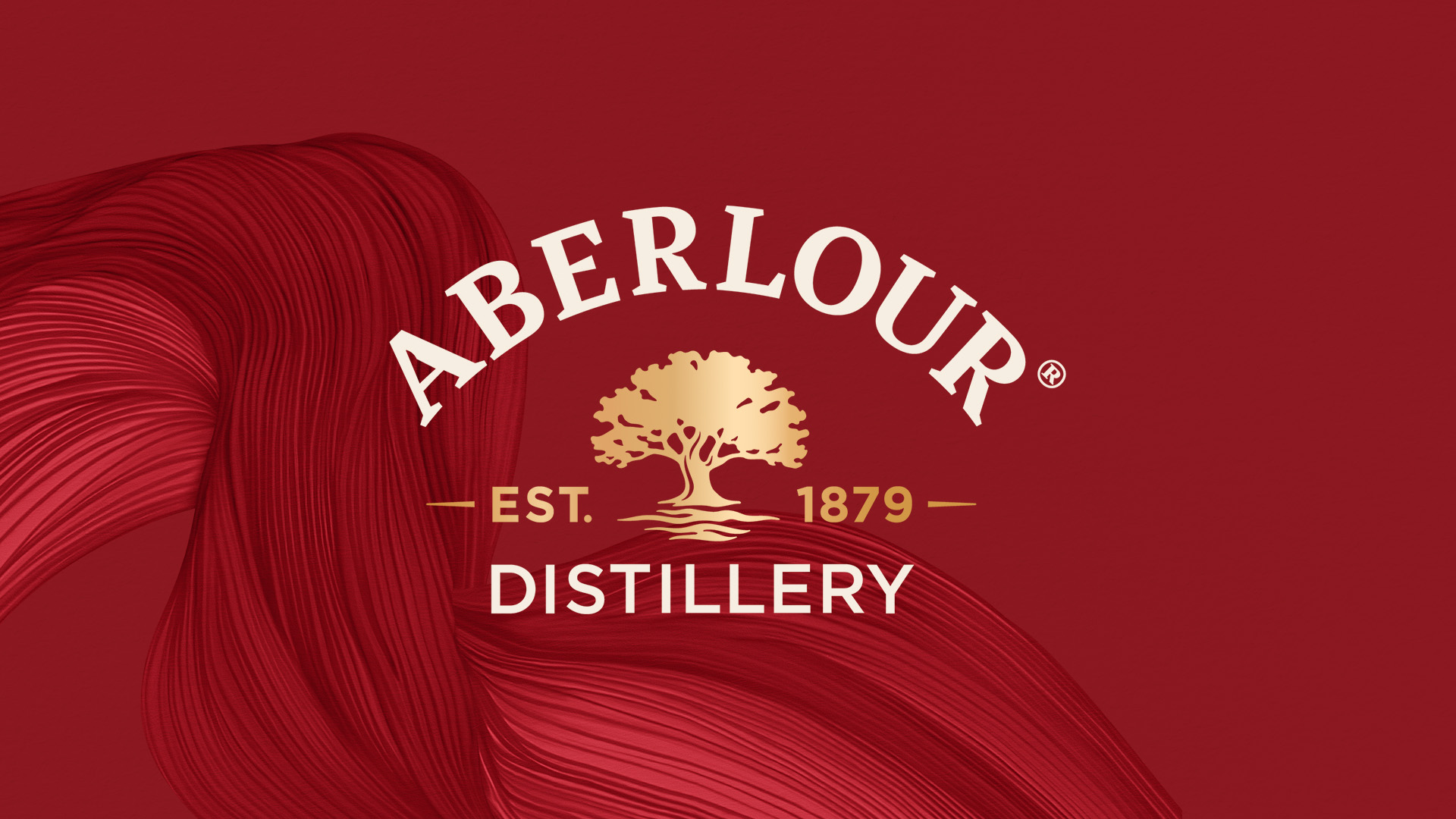
CHIC defined a fresh, bold visual identity expressing the brand’s new motto: “Everything Considered”. What does 150 years of betterment mean today?
Linking our key to the past with our path to the future. And how?
By sharing intentional care and a precision mindset: deliberate, thorough, with a love for the details.
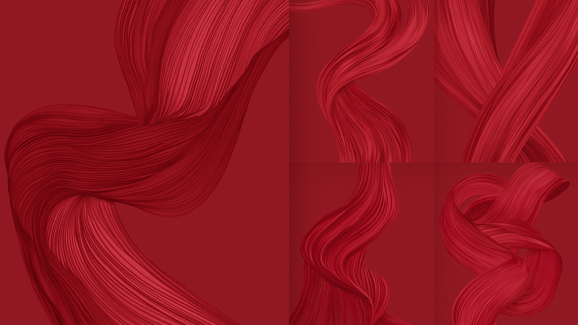
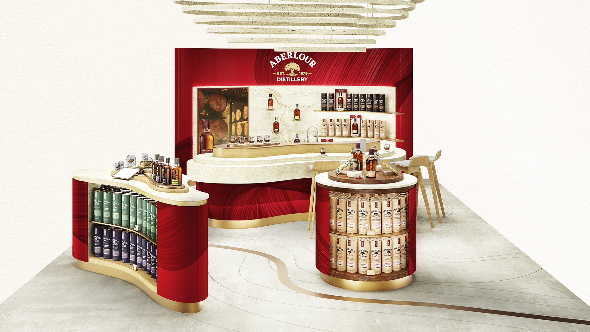
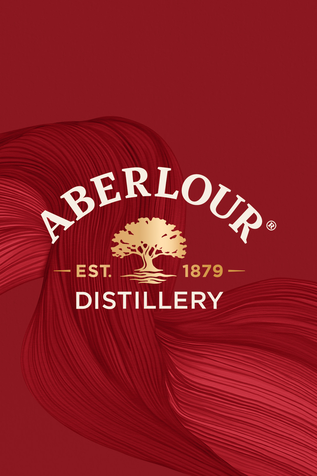
This conviction fed the signature Liquid Flow illustration, CHIC's embodiment of Aberlour’s artisan philosophy.
Starting with the Lour Burn river and sweeping through all the way to the characterful complexities of the final whisky, the details of the Liquid Flow bring every stage alive. CHIC's teams created these large-scale, bespoke artworks in Aberlour’s iconic red, and brought tactile authenticity to the brand’s visual language to invite curious minds to look closer.


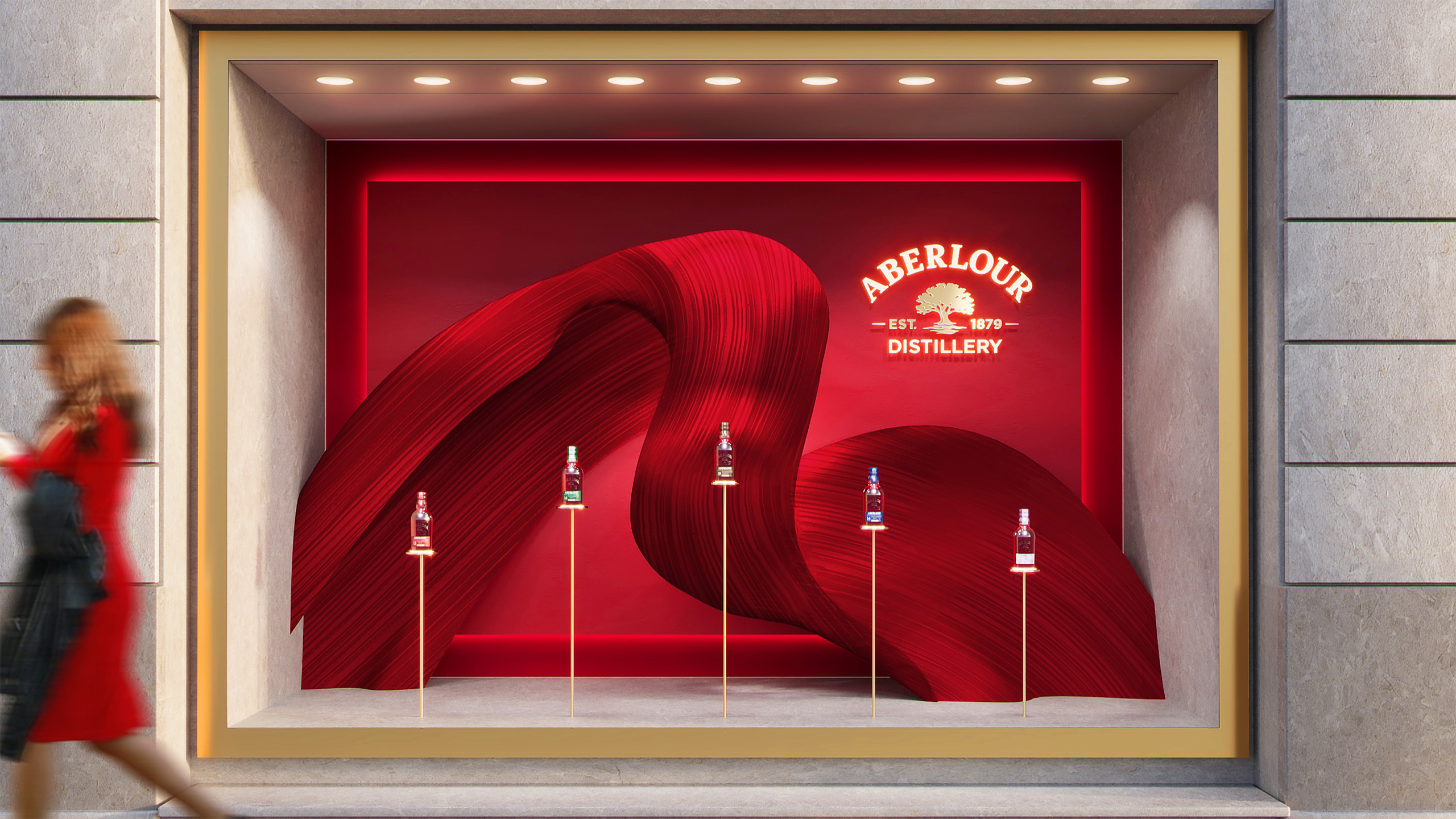
To realise Aberlour's expression as a modern artisan for retail, CHIC built/envisioned sweeping, architectural sculptures and forms.
The Liquid Flow illustration becomes alive in deeply textured, signature red forms that sit within the natural stone frame. Minimal, statuesque plinths hero Aberlour's bottles and complete the creative framing of product and brand. Organic forms and fluid lines prevail throughout the brand spaces, realised in natural materials. The Lour Burn River runs throughout as a unifying thread, uniting brand, product and space into a harmonised whole.
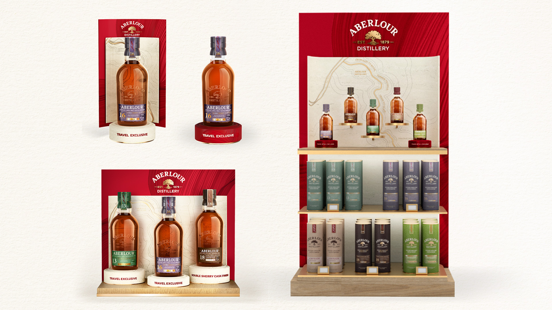
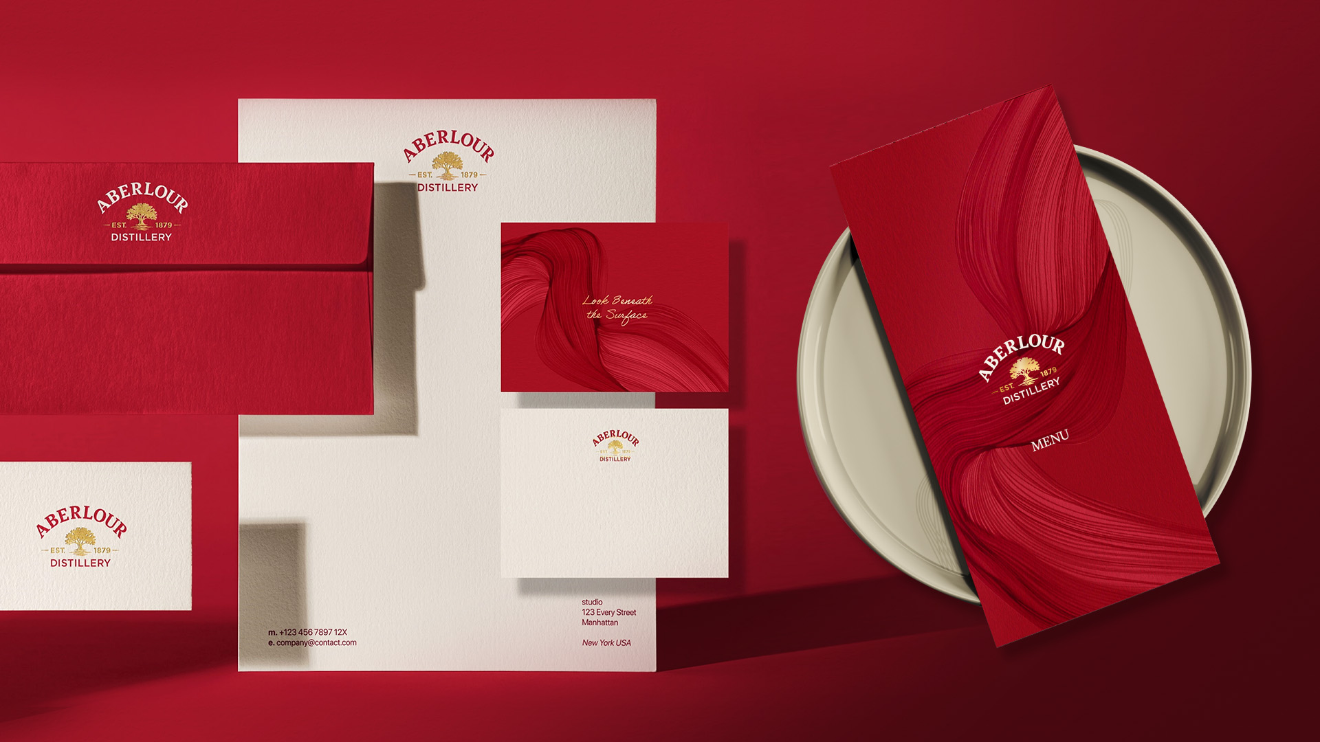
Within the comprehensive brand book, CHIC defined Aberlour’s global activation, ensuring a powerful retail and digital presence.
Just as Aberlour progresses craftsmanship, CHIC marks new ways to bring authenticity.
The handmade illustrations brought a unique value to Aberlour, expressing the “Everything Considered” statement.